

UI Guideline

06 / 2025
A guideline made to improve Smartbreeder's products, with potential to become a design system.

COMPANY
Smartbreeder

MY ROLE
Solo UX/UI designer

DURATION
21 months
(independent side job)

RESPONSABILITIES
Internal research
User flows
Visual Design
Prototyping
Handoff documentation
Design documentation
Design operations
scenario
solution
Scenario
Deeply established into the Digital Agronomic market, Smartbreeder® offers a wide variety of solutions to automate the entire daily management workflow of the sugarcane fields. The compay scaled it's services over the years, going from native to web plataforms and even tablets.
They weren’t design driven. None of their products were ever bulit with a design mindset... Solutions were rough and hard to use, and even the newest interfaces had serious usability problems.
Poblem statement
After a few talks with the R&D manager, R&D coordinator and tech leads, I canalyzed 5 big pain points:

Inconsistent resources and unusable color system
Colors, typography and sizes were a mess! The theme switching was also problematic: ‘light theme’ was unfunctional.


Consolidate visual patterns for colors, typography, sizes, components, states and microinteractions;

Fix the theme switching and set up a logical layering system.
Lack of a design library: uncentralized and incorrect component usage
Components were all scattered. They were non-generic and redundant. There was no modular buliding mindset.


Gather our assets into a functional native library on Figma, showing use states, proprieties and variations;

Become able to craft new components and more complex ideas faster, without losing consistency.

Be able to make an easy and clear handoff to developers.
Dizzled visuals caused by complex product architecture
The modules of our plataform (more than 20) were treated as sub-brands. Each one had it's own "logo" and “color”, but they were all under the platform’s visual standards. This architecture was confusing and wrong!


Propose a new visual strategy to our modules.
Heavy lack of usability on our mobile product
Spick®: Our product designed for operational workers had several problems reported after the first launch, proving that it was neither properly tested, nor adapted to it’s design target.

Mobile components: Improve Spick’s interfaces for tablets and take the first steps towards phone intrefaces too.
Research process
Component library: I've made some desk research and quick a benchmark

I reviewed all the XD files and
extracted the most funcntioal components

I analyzed their structure to
identify recurring patterns
(color usage, sizing, and spacing);

I talked with the front-end devs,
trying to understand how they made the interfaces before: what were their pain points and what they considered functional and relevant;

I quickly benchmarked well-established design systems
(especially Carbon and Material) to identify best practices and references;

I made self-taught studies about the
atomic design and design systems.
Spick®: I've made some desk research and sef-tests
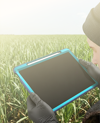
Since I could not directly access the end users, the best I could do was to canalyze user needs and pain points from client feedbacks and inisghts from advisory and R&D stakeholders.

Intense sunlight
Frequently, workers used their tablets during intense sunlight - they didn't escape even the midday sun. The app was totally unusable on dark mode.

Manual labor routine
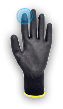
Users access their tablets inside sugarcane fields while doing out monitoring routines, they using PPEs (such as thick latex gloves).

Simple communication
Field workers are familiarized with manual activities (such as paper registering), and were unaccustomed with complex software operations. Interfaces with a lower level of complexity are more suitable.
I also self-tested my prototypes while simulating user conditions, since stakeholders were not excited about the idea of carrying out usability tests with real users and post-launch measurements.
Android recomended mobile touch area:
48 dp
Google's Material Design guidelines.
IOS recomended mobile touch area:
44 points
Apple's Human Interface Guidelines - HIG.
After tests wearing PPE gloves: 48 - 56px
I validated every prototype doing self-tests on the same tablets users would use, during very intense sunlight, while using the light theme and wearing protective gloves.
The solution
Today, the company has:
→ A component library that attends interfaces for all devices;
→ An UI guideline;
→ Handoff-driven assets for documentation;
→ A master model file for the prototypes.
Component library
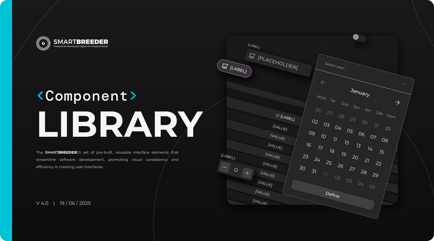
- 56 reusable components;
- Handoff-based components;
- Color, typography, grid and space variables applied;
- Semantic proprieties, based on Material Design.
Component library (crafted microinteractions)
Some animations, icons and microinteractions were crafted, in order to provide a more personalized experience and consolidate a unique identity for the system.


No results found
Please review the value entered and try again.
Component library (Handoff-based components)
This set of components helped documenting rules, component behaviours and interactions faster.

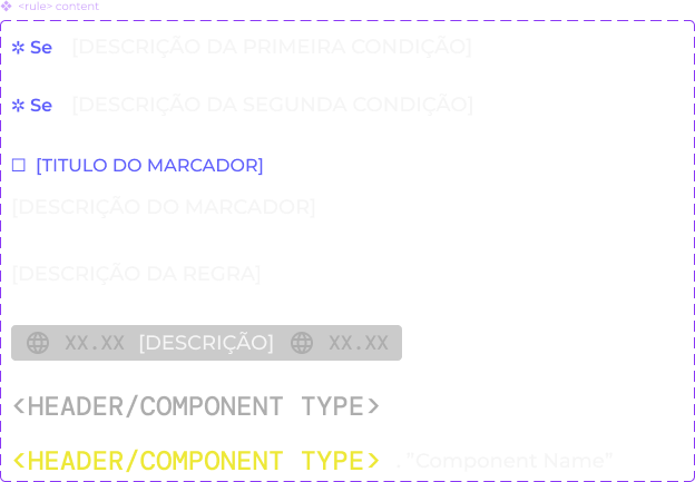

devs couldn’t access important information before
Keep in mind that only one Figma license was avaliable on the company - and since I was constantly using it, devs couldn’t use the dev mode to quickly access relevant protoype content.
UI Guideline (color system)
The guideline documented color variables, tokens, context usage and the layering system.

The document unravels the color tokens usage and the dark, light and high-contrast themes. Besides that:
- Glass fills were standarized;
- [NEW] - Semantic colors: used to communicate event messages;
- [NEW] - Support colors: designed to highlight specific elements and charts;
- [NEW] - Support colors: gradient applications on charts.
60 : 30 : 10 system consolidated, working with multiple color themes and across 4 different accent colors
New architecture for the modules
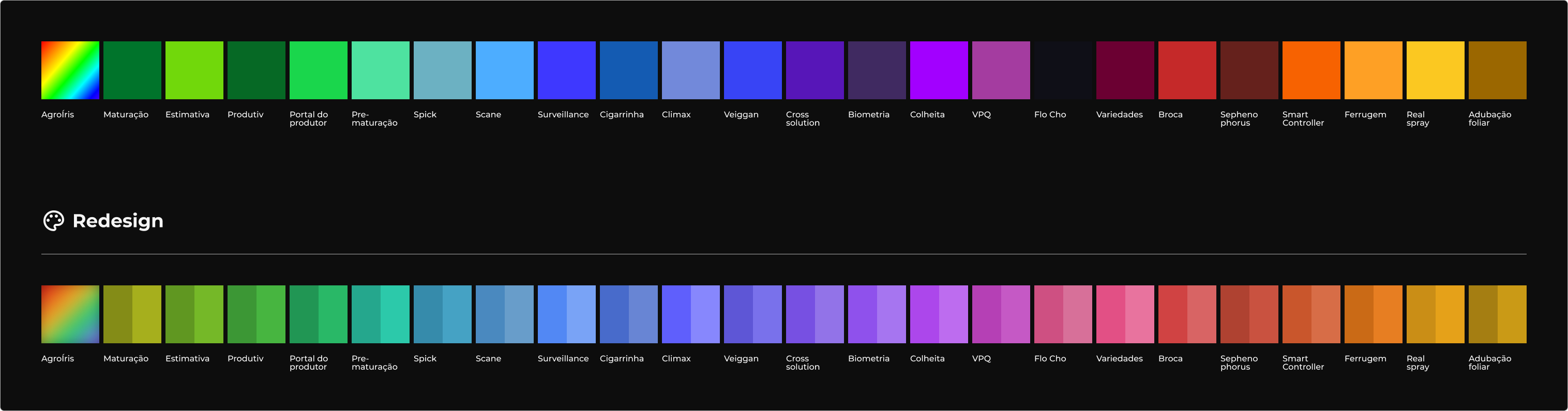

The new colors were tested with grayscale filters, in order to optimize the legibility in both light and dark themes;
Included a ‘highlight’ variant to make some basic state interactions.
Since the amount of colors was still inadequate and confusing, my final design proposal was to use a scheme based on Smartbreeder’s solution categories, rather than assigning a color to each module.

Culture surveillance

4.0 Management

Culture management

Crop estimation

I picked up 4 colors from my redesign proposal;
The colors were chosen based on the simbolic approach of each category.
UI Guideline (grids and spacing system)
With components having 3 to 5 size proprieties and defined grids and a sets of spacing variables, the library could be used on interfaces from multiple devices.
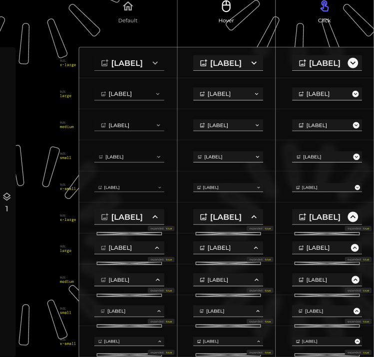
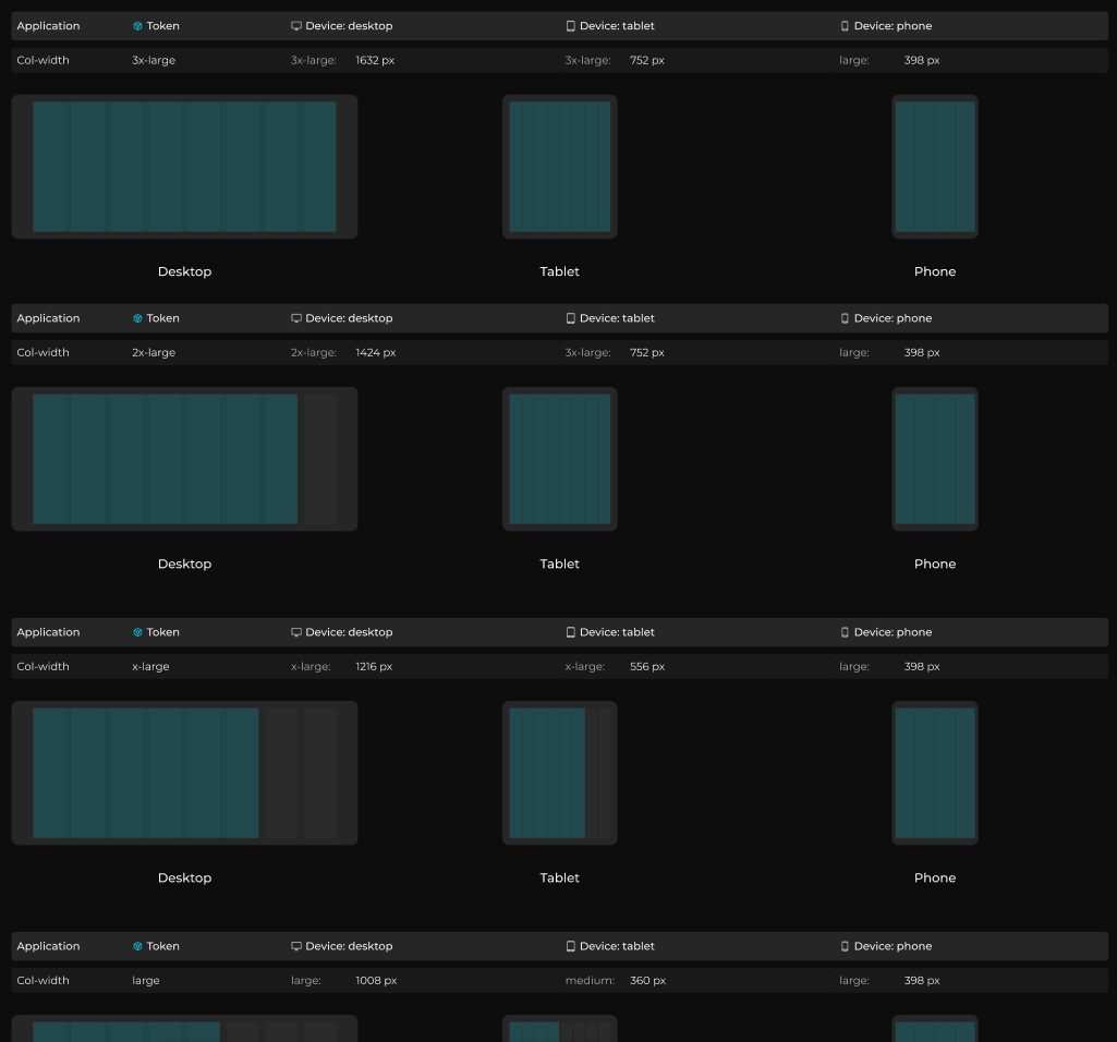
Baseline concept
The 8px baseline was used to define component sizes and spacing values.
size: medium (40px)
size: small (32px)
size: x-small (24px)

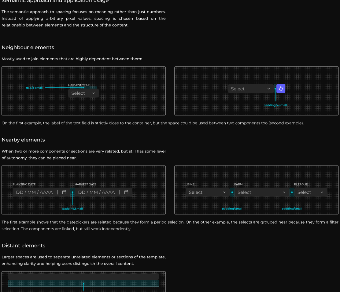
padding/x-small

padding/large

padding/2x-large

padding/3x-large

padding/4x-large
Design decisions related to gaps, paddings and margins were documented too
UI guideline (document structure)
The ”button” page below can exemplify how most of the components were documented
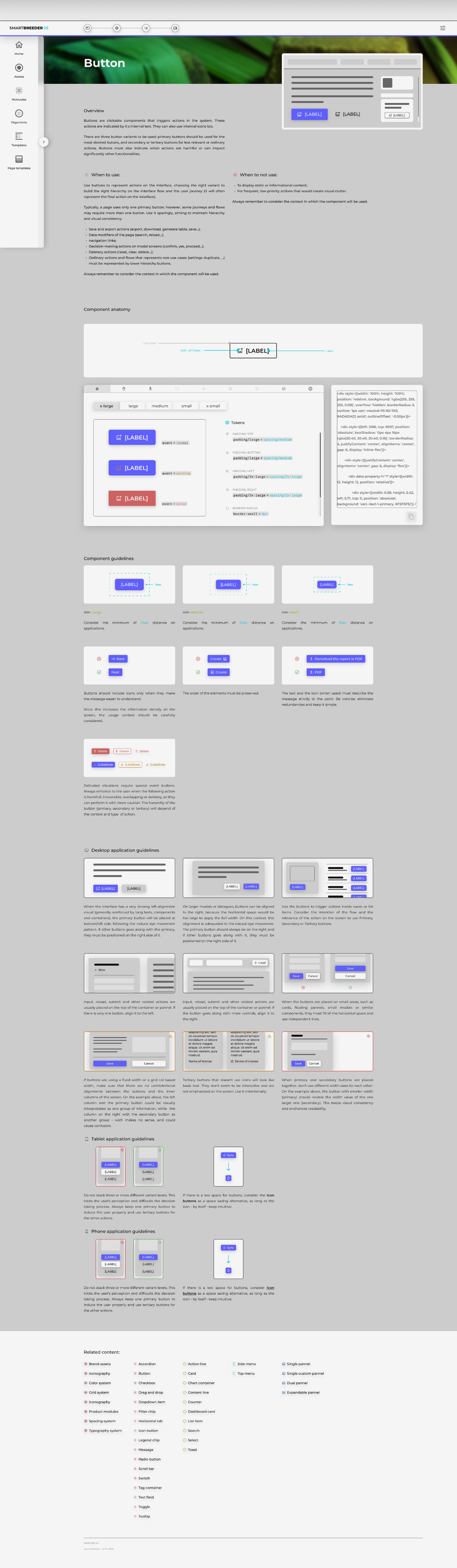
Overview

A brief description of the component: overview; "When to use” cases and "When not to use" cases.
Component structure
Anatomy: represents the component structure, pointing the elements that form it. They also indicate wich elements are optional, editable, or fixed.Interactive showcase: change between state proprieties, size priorieties and component's specific proprieties to see instant changes.
Component guidelines
Shows the correct usage of the component proprieties.
Application guidelines
Shows the correct application on interfaces (how it should be placed or interact with other components or elements). The applicaiton proprieties are divided into three sections: Desktop guidelines and general applications, exclusive tablet applications and exclusive phone applications.
Master model file with a Figma tutorial section
My intention was to centralyze discussions with stakeholders about prototypes, flows and frameworks. As no one had heard of Figma, I created a “tutorial” section to present each section of the file and encourage them to interact and simulate the prototypes on their own.
You can check the files by yourself:


UI GUIDLEINE APPLICATION
COMPONENT LIBRARY
The impact

The library helped making more than 56 prototypes
successfully
Most of them used only components from the component library.

Project-specific components could be crafted faster and consistently
All the components relied solely on what was on the library (atoms, molecules...)

The library suited enough component size proprieties to all devices
All of them have at least 3 size proprieties. Some of them have even 5.

Spick project redesigned for tablet and for phones now
The interfaces needed these resources for it's visual items and status communication.

Exclusive handoff components improved the process
It supports spcifying the files, describe prototype rules and flows.

R&D devs and tech leaders quickly familiarized with it
The R&D team welcomed positively the arrival of design and it’s first changes.
There are a few more topics worth highlighting:

Established event and support colors for the system;
+ 160 new custom made icons added to the iconography;
Third color theme proposal: high contrast - although it is very embryonic;
A standard Figma design file for all the prototypes, with organized stucture and ready-made sections;
maintenance and follow-up cycle
I suggested as a maintenance routine to drive surveys with developers and POs (I think one every quarter would be ideal), to understand the current efficience and level of satisfaction of what has been bulit then. Feedbacks could be filtered and set as technical debts and prioritized by severity level.
Since I couldn’t directly access the final users, the owners could bring some qualitative feedbacks and relevant KPIs whenever possible during the quarterly reviews.

As a junior solo UX/UI, I only knew the surface of design ops, and had to be completely self-taught during the whole process - wich made it a huge challenge.
→ I would go deeper into design tokens:
During later studies, I realized how important was to set hierarchical levels for tokens, even for kickoffs or first iterations. At firrst, I didn’t know how to make it, so I kept them generic, with the intention to refine them later with further learnings.
→ I needed to apply the atomic design concept for real:
Later, I realized that I drifted away from the original atomic design concept, and several components were misclassified.
→ I would rethink responsiveness and size variants:
I defined 3 to 5 sizes to see how it worked, and refine it later. The number of variants were probably excessive, and made decision taking more difficult.
→ I woud revisit my grid strategy:
The grid system was over-engineered and offered limited practical benefit. Column widths and margins relied mostly on variable values, resulting in weak correspondence between grid logic and real component behavior.
→ Last but not least: master my UI:
At the time, I prioritized clarity and functionality. This is a valuable idea, but I think I could've been more sofisticated with it.

improvements i would make
Design tokens need about 3 token levels: Global token → Alias token → Component-specific token. Make things component-specific would fix some icoherences on the current UI and standarize decision takings.
I would correct some of my atomic design classifications (elements I defined as molecules were often atoms, and many organisms were closer to molecules. Some templates could also be considered organisms).
I would reduce the amount of size variants and rethink about their usage per device.
Instead of unstable grids, components could respond better to fixed dimensions with contextual adjustments driven by breakpoints.
I wouldmake everything more beautiful and visual appealing. More detailed and subtle interactions and improved motions.
acessibility considerations
As this is an ethical issue, and one that I take much more seriously than as single KPI, I really think I owe this part:
I took accessibility and inclusion as key topics since the beginning, and I know that the currrent color and typography systems are inadequate from these standpoints. This happened because, after several alignments with stakeholders, it was decided that new design updates should still maintain some aspects of the exhisting interfaces (extensive amount of colors, complex layering structures, dense charts...).
I could realize how worried they were about high changes on legacy interfaces. They were understandably cautious about how it could affect both the legacy code and the users’ familiarity with the products.
Looking ahead, it will be essential to revisit this topic. I think all the color system should- at least - pass all WCAG standards, and the overall complexity of these systems must be reviewed.
FINAL CONSIDERATION
I would believe more in myself, my intuiton and on my insights.
I have challenged myself to do something no one asked me to do - This project was beyond my team's expectations. I realized that I was never on the wrong path, just learning step by step. Even with misconceptions, I was moving foward (even independently), and actively seeking knowledge.
I see how this experience reinforced my ability to self-direct learning, adapt quickly, and improve continuously.

Still interested in viewing the files? here they are:
UI GUIDLEINE APPLICATION
COMPONENT LIBRARY
Visit other cases:

UI guideline
A guideline designed to improve Smartbreeder's solutions, with potential to become a design system.
ADVOCACY RESPONSIVE WEBSITE
A website with a structure focused on services, customized for a company that is starting out in the legal field.
Let’s design together!

graphicdesigner.marcus@gmail.com

+55 (19) 99430 4848
Location
Currently living in Piracicaba (SP).
Looking for new cities.

DOWNLOAD MY RESUME

Marcus Vinicius Henrique Belli
// Product designer
I’m also here:


