home
cases ಠ_ಠ
resume
about me


Responsive website for MCS advocacy

05 / 2023
An institutional single-page responsive website designed for an advocacy company.

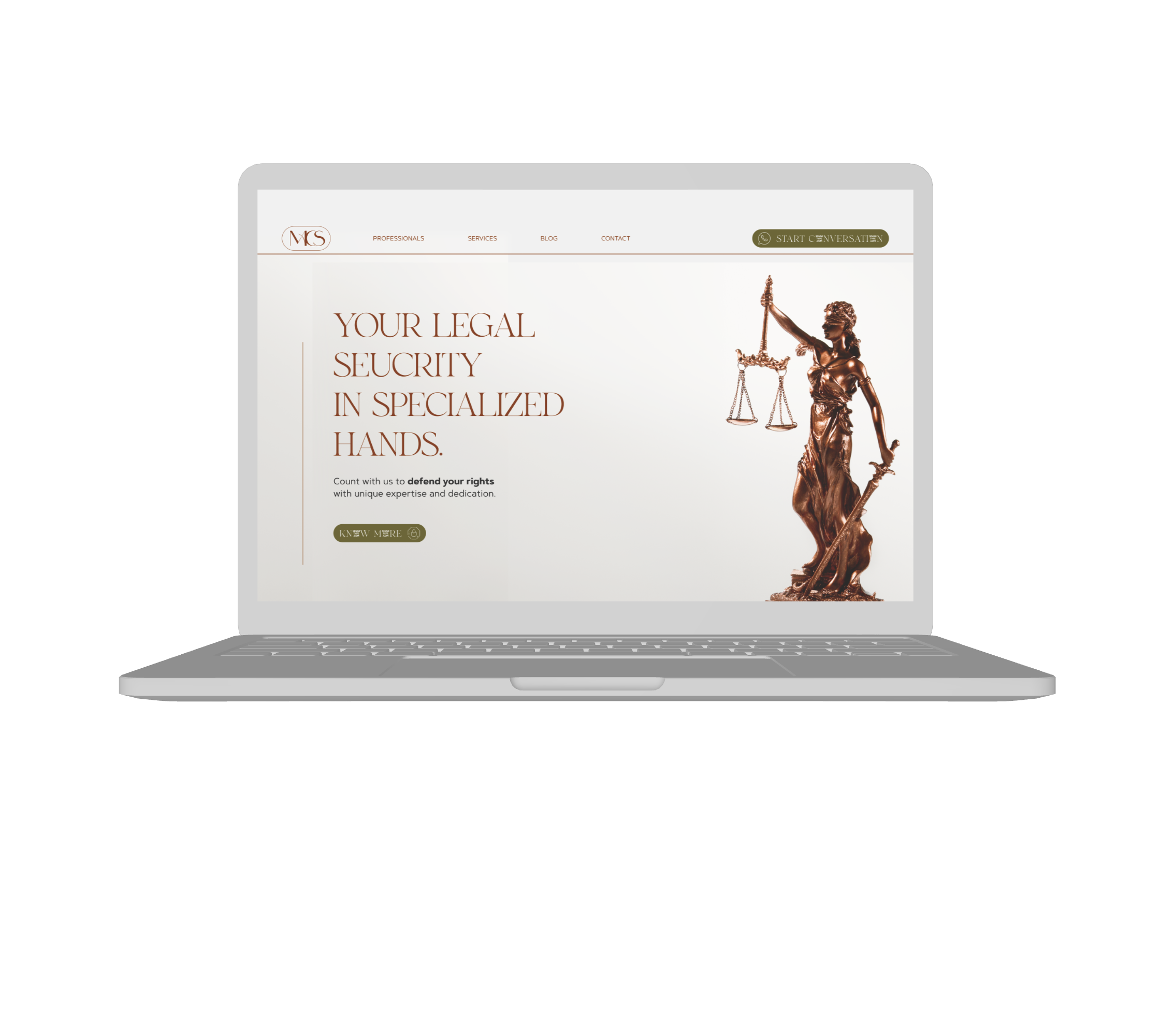
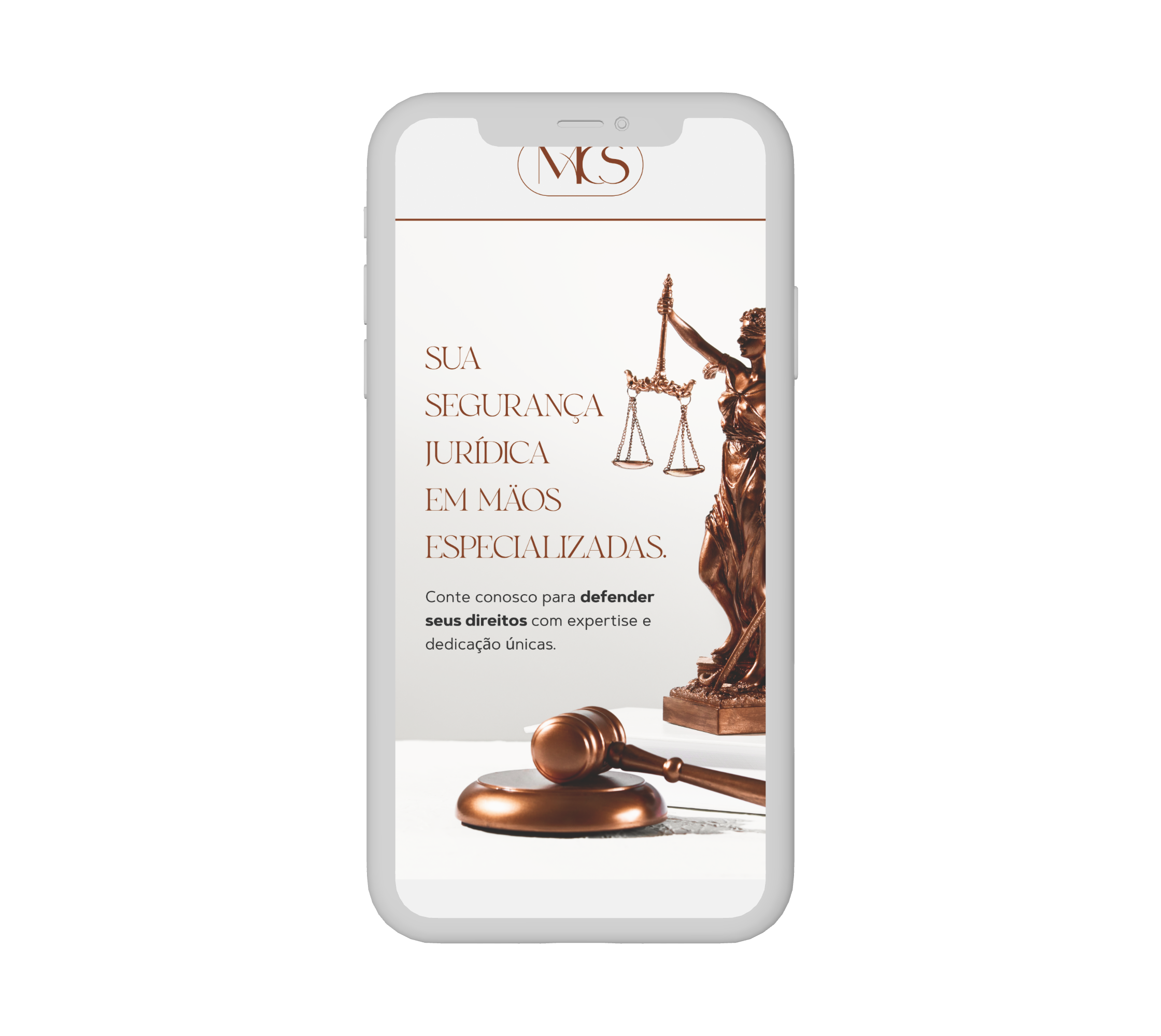


scenario
MCS Advocacy was a starting company, and my client (brother of the CEO) wanted to present her with a website. His initial idea was just to create an attractive visual showcase of it, and he had no strategy or content idea on his mind.
Problem statement
It was a very simple request, but I knew wee could make more than a good-looking interface. Why not deliver a website with purpose and intentional concept? I suggested that we should work beyond aesthetics.
I defined the statements of the problem, and also established an additional premise about strategy:

Define the website’s scope and structure content together with the client
The client only had a superficial idea of the product. It would be a good opportunity to help him taking decisions from a more strategic perspective.
Deliver a responsive website that work on multiple devices
The product should perfom on many resolutions, and had to work on desktop and mobile devices.
Follow MCS’s established visual identity
MCS already had a short visual identity document, containing essential elements (logo, color palette and fonts).
The solution
MCS advocacy recieved a single-page website, with an easy and linear navigation system, with clear standouts, with its sophisticated identity.
You can check the file by yourself:


DESIGN FILE
The process
I could align the strategy and scope alog with the client through conversations, and also define other important features of it later:
Quick online research and first alignments
I tought the best way to introduce my client into a discussion he doesn’t dominante was to offer some simple and practical examples, so I took an online research, seeking for some website structures of the segment (some of them were used as visual references for me too).
Finally, I presented two structure approaches for the client (institutional and solution-driven), and explained the strategy behind each of them.
I'm going to send what I thought here to the scope... I have a question because there are 2 standard website structures, strongly related to the company's segment. There are institutional websites and websites focused on providing services. I'm going to give you a brief summary so you can tell me what you think is most appropriate.
12:38

Basically, the institutional website is more comprehensive and aims to provide an overview of the company
12:38

while the professional services website highlights specific services and the team's expertise to attract potential clients.
12:38
Obviously, many things do not have this standard structure, and are adapted in each case.
12:38
[EXTENSIVE TEXT ABOUT EACH TYPE OF WEBSITE THAT IS NOT WORTH PUTTING HERE]
12:38
After some feedback, we defined that a services-focused model structure would be more appropriate than an institutional one. We aligned the core objectives (positioning, service specification and lead generation) and I translated it all into a structured content hierarchy:
- Hero section communicating value proposition and CTA
- Trust-building elements (key differentiators and professionals);
- Clear breakdown of services;
- Optional content expansion (exemplified with blog, but it could be client testimonials);
- Direct contact form.
Decisions such as excluding portfolio prioritizing WhatsApp/form contact were validated with the client based on the current business maturity. The website also remained flexible for future content expansion.
Single-page navigation
Single-page navigation was a suitable choice for institutional websites with short content: easy acess and few clicks.

Professionals
Services
Blog
Contact


Strategic call-to-action

CALL TO ACTION

Typography adaptation
The MCS visual identity document introduced two font families:
- Display/highlights: Lucky beauty
- Body: Fontspring demo
There was no legal license, and the body font didn’t have the appropriate characters with accents, basic punctuations and some numbers were missing too. I had to adapt:
Display/highlights: Lucky beauty → Cinzel
Body: Fontspring demo → Gothic A1
The document structure
Although a handoff wasn't necessary, I organized the files and documented some assets:
Color scheme
Since I could use well all the colors avaliable on the visual identity documentation, I only added some event colors to the Web color scheme (#AB4949, #D79E47 and #53A523), since some components (like text imput) require it.
Typography
Using the two fonts I choose to adapt on the web, I could create a typography structure to standarize some design decisions.
Some of them may have the same size, but the line height or weight may vary according to the use context (i.e. inside components).
Imagery
Since the visual identity material didn't had an image use section, I gathered some interesting images and structured a simple imagery concept.
Comically, none of them were used on the final version.
Iconography


It was challenging to turn some abstract legal field concepts into more visual information, but this set of icons from Shutterstock helped me with it. It also preserved legibility and visual coherence with the other elements.And yes, I have the legal license of it.

What did I learn?
Here are my final thoughts about what this project was for me and what did it meant for my evolution.
The project was quick and simple, and it confirmed to me that not all design work needs to be bureaucratic and lengthy to be strategic. It's the designer's responsibility to adapt to the client's needs.
→ Even on tiny projects, there is always more to be done than “make it beautiful”
Only through a good alignment about strategy and content, it was possible to achieve a clear structure.
→ Even nowdays, some designers still make inappropriate visual identities
The color palette was very useful, but the document's font families were not legally licensed, nor did they combine characters with accents or basic punctuation. There was no imagery documentation and the document lacked any type of visual concepts, such as social media applications and icon families.

improvements i would make
I could enhance the experience by creating more sophisticated and detailed microinteractions. This would make the experience truly unique, and elevate the perceived value of the brand.

Still interested in viewing the file? here it is:
DESIGN FILE
Visit other cases:

UI guideline
A guideline designed to improve Smartbreeder's solutions, with potential to become a design system.
TASK-ORIENTED CRM
A mobile application specialized in customer management and generating quotes for construction equipment rental companies.
Let’s design together!

graphicdesigner.marcus@gmail.com

+55 (19) 99430 4848
Location
Currently living in Piracicaba (SP).
Looking for new cities.

DOWNLOAD MY RESUME

Marcus Vinicius Henrique Belli
// Product designer
I’m also here:


