home
cases ಠ_ಠ
resume
about me


Task-oriented CRM

01 / 2026
A mobile platform designed to manage the customers and quotations of equipment rental companies.


scenario
Bidrock is part of a concept project I made to support sales and service professionals manage multiple rental quotations on construction rental equipment companies.
Problem statement
The purpose of it is to bring more agility, control, and clarity to the budgeting and negotiation process.
I established some premises for this project:

The CRM should be designed as a mobile application
This allows construction rental workers to operate effectively even when off-site.
Quotations need to be generated as quickly as possible
The quotation generation process should be streamlined for speed.
A straightforward and functional follow-up process is essential
The app should provide a clear visualization of customer status.
Reminders to assist app users are necessary
Since app users juggle multiple tasks, notifications should help them avoid missing deadlines or important actions.
Effortless tracking of WhatsApp chats is important
Easily accessing the communication channels used by clients is crucial for enhancing user agility.
I self-challenged myself to a 12 hour “sprint” research for this project
Research and definition phases must've been done at this time.
The solution
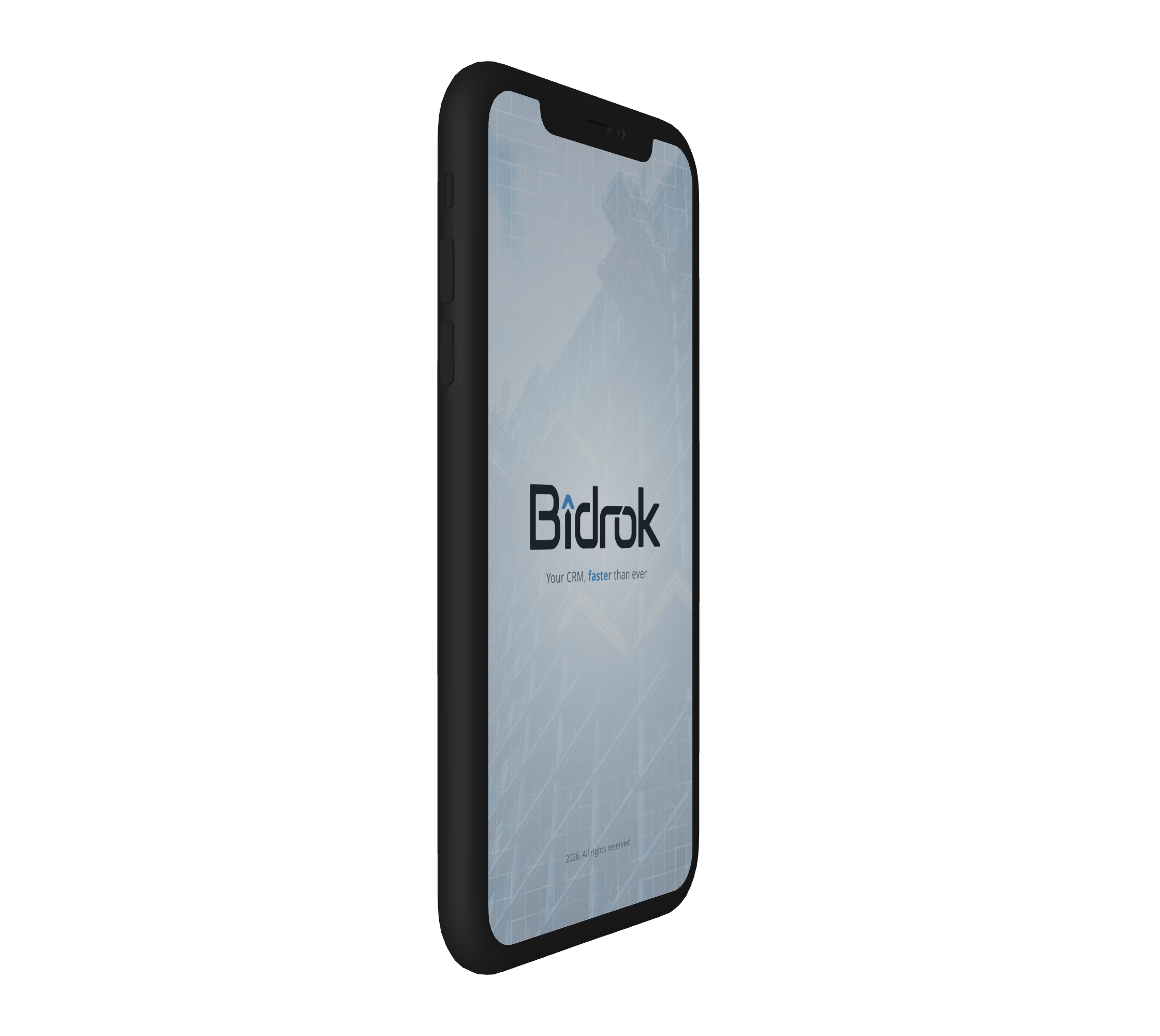
Meet Bidrock — a task-oriented CRM app focused on direct communication with clients in the construction equipment rental context.


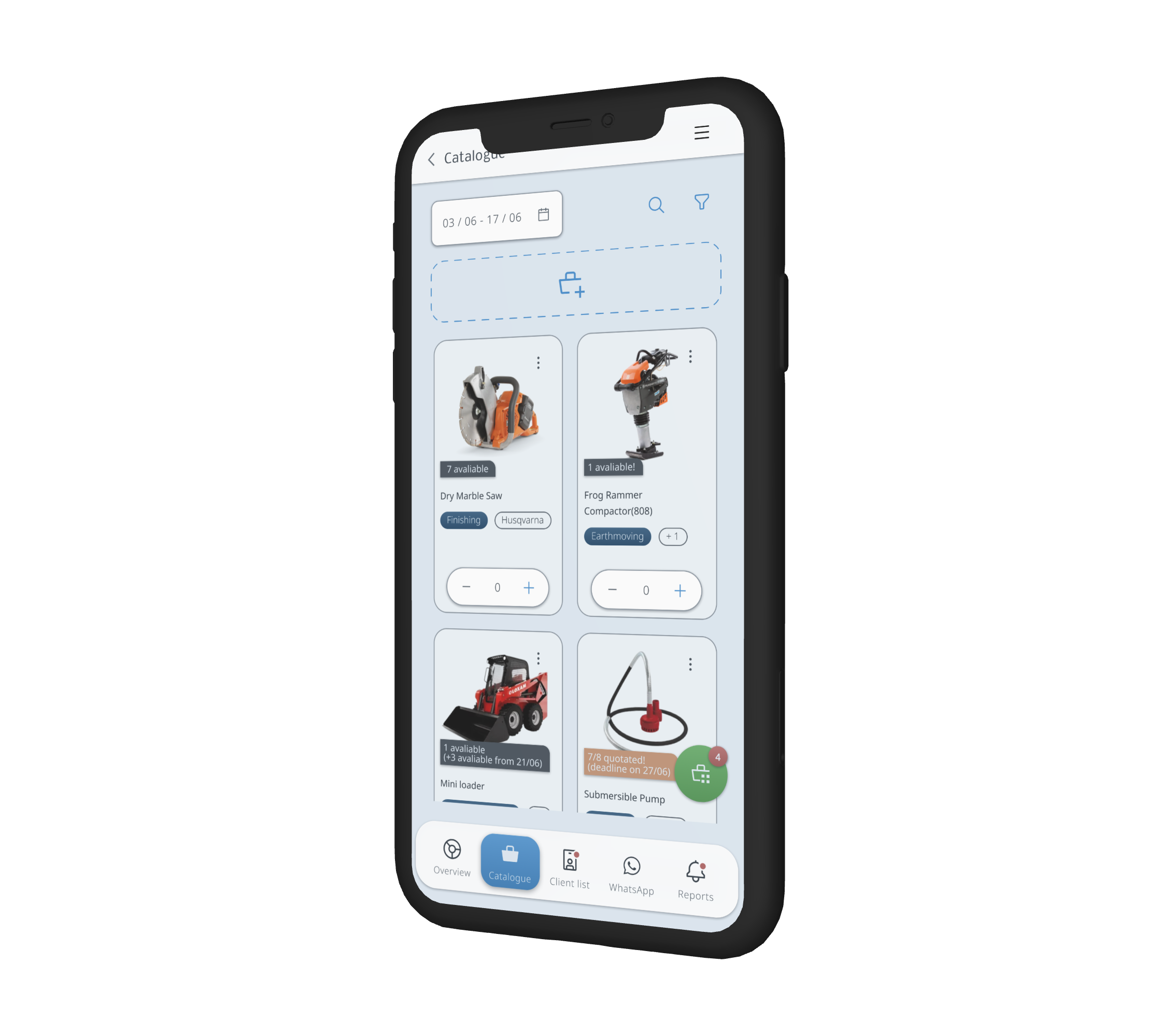
Designed to generate new quotations with just a few taps!
Bidrock’s streamlined process allows users to make new quotes for registered clients quickly. Drag products to your cart and filter by category, brand, or status with an optimized product catalog view.


Bid + bedrock = Bidrock.
The name reflects the synthesis of construction foundations with the app's dynamic quoting feature, resulting in a memorable and straightforward name.

Visual concept
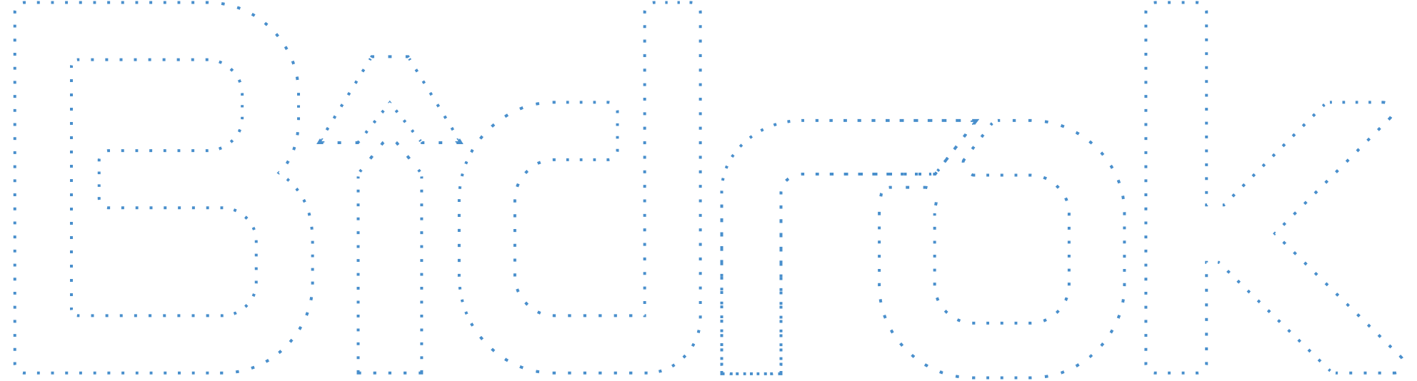
The logo is based on solid and straight shapes, in order to reflect the brand's operational context and product offerings, meanwhile its rounded edges enhance accessibility and create a friendly, ergonomic feel. This attention to detail and refinement elevates the user experience, effectively positioning the brand in the digital landscape.


After a brainstorm, Nokora was selected for its versatility across devices, offering various weight options and ensuring readability, even on smaller screens.
Color scheme
The 'soft blue' conveys solidity and modernity, instilling confidence in the brand's digital presence.
ACCENT
neutrals
Support
You can check the files by yourself:

PROTOTYPE
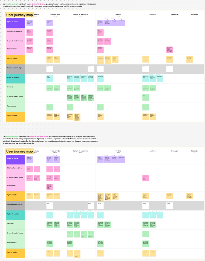
RESEARCH
The process
From research to prototyping: I embarked on a journey to explore and define a solution within just 12 hours. Without any access to confidential company data, I had to rely on online information only. My understanding of the construction franchise sector was minimal, and I wasn’t aware of the daily challenges faced by users and clients.
I set as my primary goal to gain some context and compile evidence to effectively articulate the problem.

00:00 / 12:00
Online research
First of all, I defined 3 main objectives for my desk research:
- Take a quick context about construction franchises: what do they do/offer, how do they place themselves on the market, what are their business goals, values, targets, and how do they make quotations today.
- Who are the main players? How do they position themselves on their market? What are their strenghs, weakness and what are the gaps on the market?
- Who are the interal users of this CRM? (objective context, behaviour) and who are their customers that ask for quotations? (objective context, behaviour)
1.
I defined some of the main topics to structure a single-page document. I synthetized the content from the companies to fulfill the main topics.
2.
I gathered insights from 3 big companies of the sector in Brazil to make a SWOT pannel.
3.
With some demographic data and notes about objective, context and behaviour from clients and internal users, I’ve sort them into 2 protopersonas each, since it was one prompt away from it.
5:00 / 7:00
Definition
I used the notes from users and the single-page to structure some canvas and draw a stategic approach:
I joined the company/market document with the protopersonas to draw a value proposition canvas.
I sketched a use case of a quotation based on the user and client personas, and mapped the main opportunities that could come from it.
I made a design critique (usability checklist + sitemap view) of a well-known software used for quotations (Locamus).
Since I was on a time-tracking, I decided to use the Lean UX canvas hypotesis concept, since I was more familiar with it than other frameworks (like “Jobs To Be Done”). It enabled me to state the problem quickly.
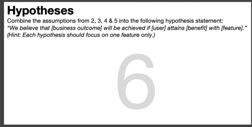

We believe that [business outcome] will be achieved if [user] attains [benefit] with [feature].

[business outcome]
Why does it matter?
- Exceptional service experience as a competitive differentiation;
- Higher prospect conversion rate;
- Digital positioning.
[user]
- Use more than one communication channel (budget and whatsapp);
- Deal with lots of clients simutaneously;
- Follow up request and rental status.
[benefit]
Why they could be helped?
- Reduce potentical budget quotation mistakes;
- Tracking down client’s steps during all the phases of the process;
- Imrpove client experience (exceptional service).
[feature]
How they could be helped?
Creating a simplified, agile and integrated platform, that offers quick access to client messages, at the same time it allowed renting quotations with a few interactions.
- Strict message tracking;
- Item and status follow up;
- Simple and strict to the point interface;
- Clear information hierarchy and status visualization;
- Client rental tracking;
- Reporting activities (new, pending, ...)
09:00 / 3:00
Basic prototyping
I sketched a flow based on the user journey map to take a closer look into the interactions.
With the user flow and the user insights, I’ve made some sketches of how the sitemap should be, placing the features based on the opportunities, user mindset and user needs.
Following the sitemap structure, I sketched some important interfaces to test how some features and internal items would fit in (a quick “medium-fidelity” prototipation).
12:00 / 0:00
The document structure
Design tokens
I decided to work with 3 token layers (Primitive, Semantic and ComponentSpecific) to improve scalability and standarize my visual decisions.
Primitive

NEUTRAL
white
#
FFFFFF
neutral97
#
edf3f7
neutral95
#
DFE9F2
neutral90
#
D1DBE5
neutral80
#
B9C3CD
neutral72
#
A3ADB7
neutral64
#
8F99A3
neutral46
#
626C76
neutral38
#
4C5660
neutral30
#
38424D
neutral20
#
202933
ACCENT
tint4
#
92BCE0
tint3
#
7FB0DB
tint2
#
6DA5D6
tint1
#
5B9AD1
natural
#
498FCC
...
Semantic

TEXTS
TextFilled
primitive/neutral38
TextAccent
primitive/accent/natural
TextPrimary
primitive/neutral30
TextInverse
primitive/neutral95
TextSecondary
primitive/neutral46
TextPlaceholder
primitive/neutral46
TextDisabled
primitive/neutral46
SURFACES
SurfaceBase
primitive/neutral95
SurfaceElevation
primitive/neutral/white
SurfaceElevationSuccess
primitive/greens/tint4
SurfaceElevationWarning
primitive/oranges/tint4
SurfaceElevationError
primitive/reds/tint4
SurfaceThickGlass
primitiveopacity/whiteOpacity88
SurfaceThinGlass
primitiveopacity/whiteOpacity50
SurfaceSubtle
primitive/neutral97
SurfaceInverse
primitive/neutral38
...
ComponentSpecific
ACCORDION / DEFAULT
Surface
Semantic/surfaces/SurfaceElevation
Icon
Semantic/texts/TextSecondary
Line
Semantic/texts/TextSecondary
ACCORDION / FOCUS
Surface
Semantic/surfaces/SurfaceElevation
Icon
Semantic/texts/TextSecondary
Line
Semantic/texts/TextSecondary
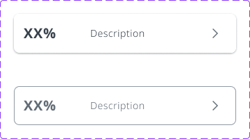
CARD / DEFAULT
Surface
Semantic/texts/TextPrimary
Border
Semantic/borders/BorderSubtle
LeftIcon
Semantic/texts/TextAccent
Text
Semantic/texts/TextPrimary
RightIcon
Semantic/texts/TextAccent
Label
Semantic/texts/TextPrimary
CARD / DISABLED
Label
Semantic/texts/TextPrimary
Border
Semantic/borders/BorderSubtle
...
Components
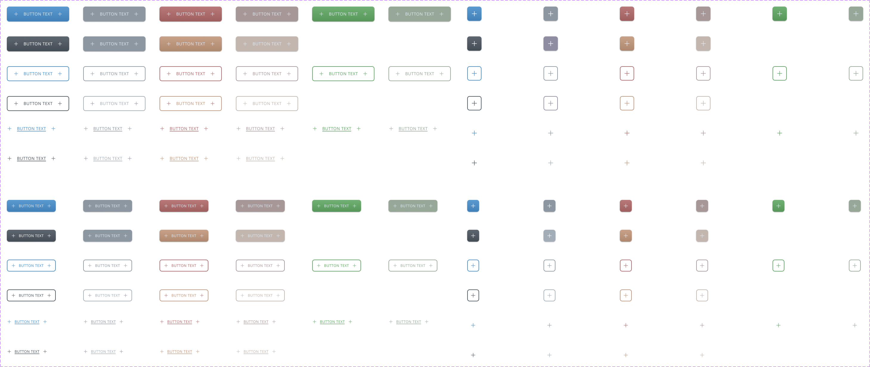
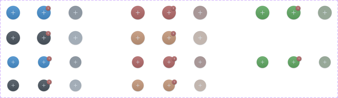
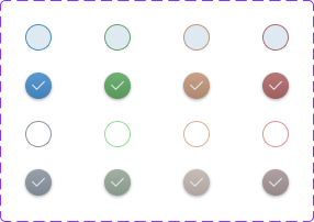
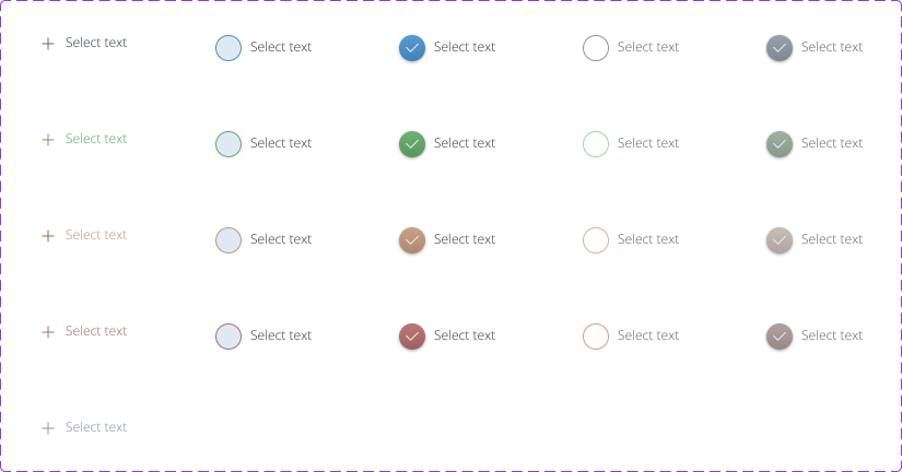
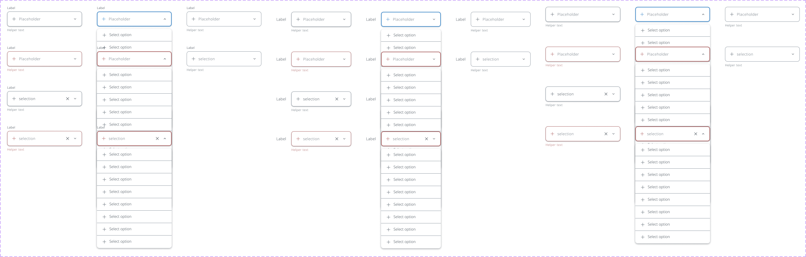
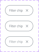
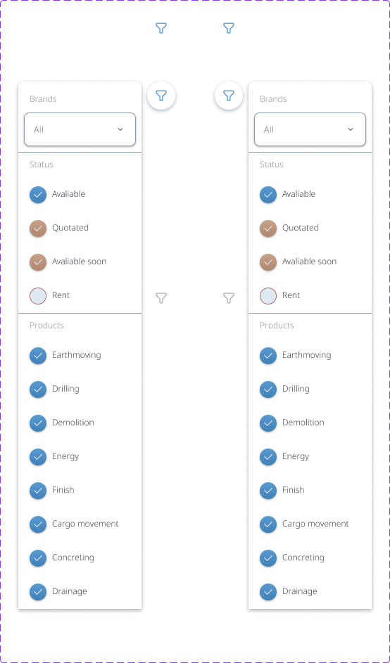
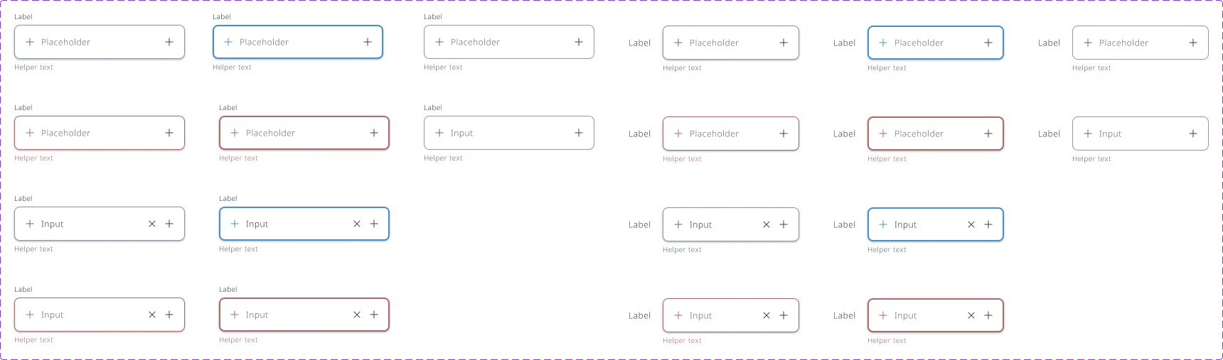
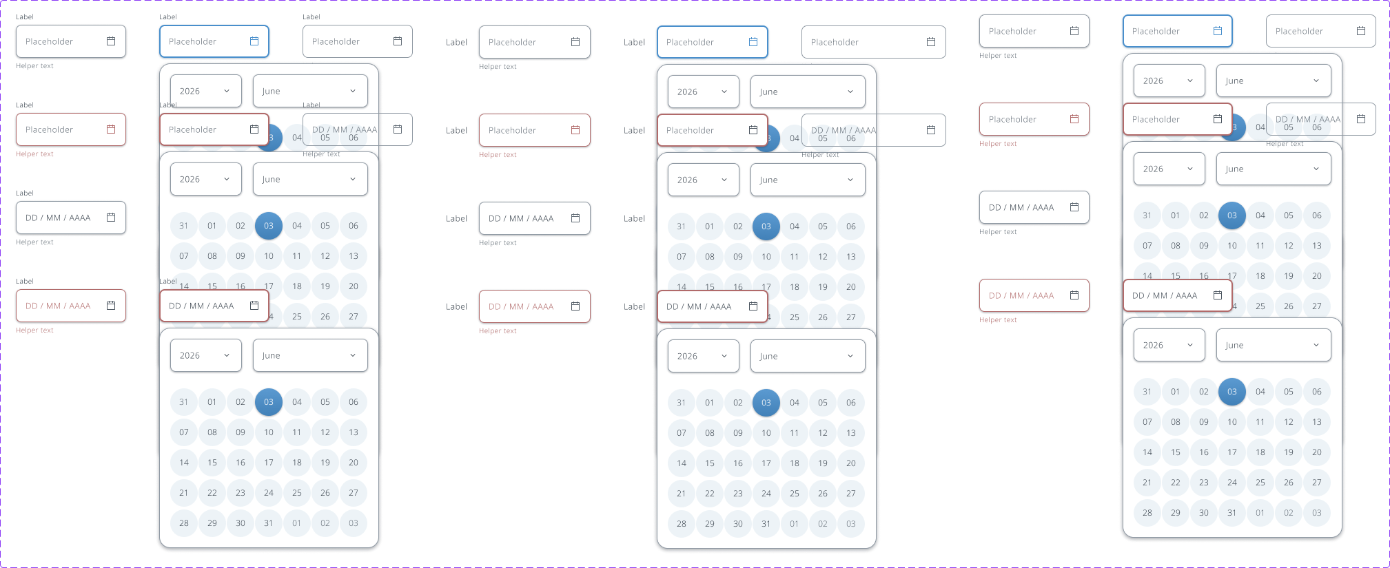
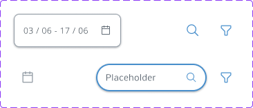
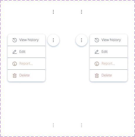
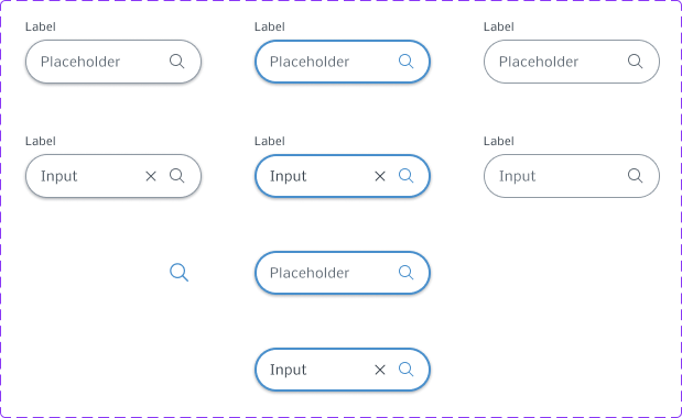
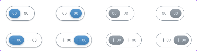
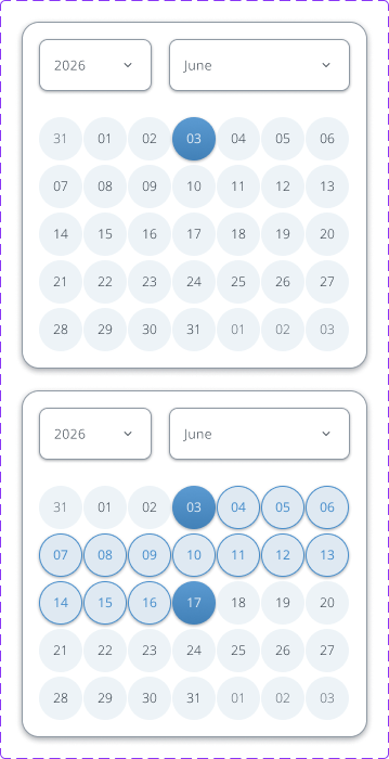
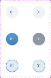
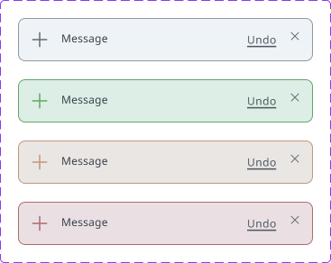
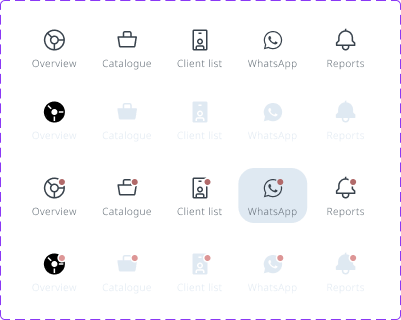
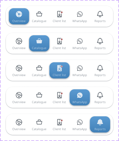
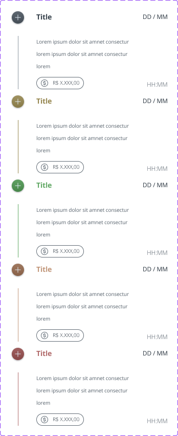
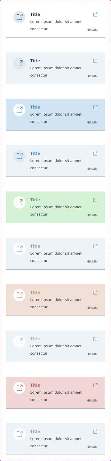
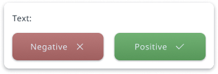
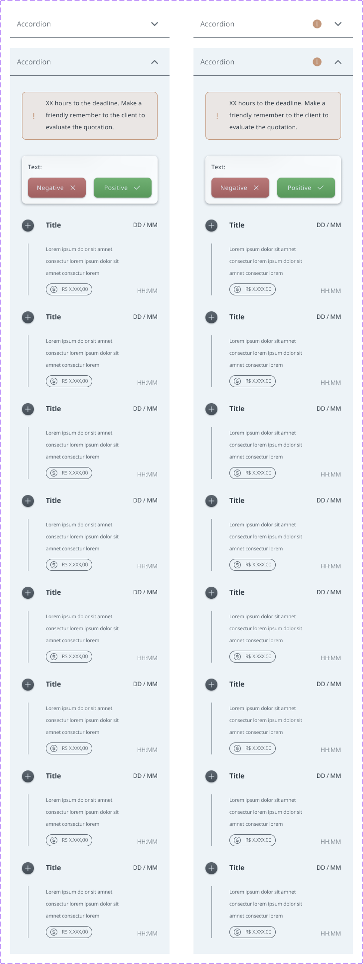
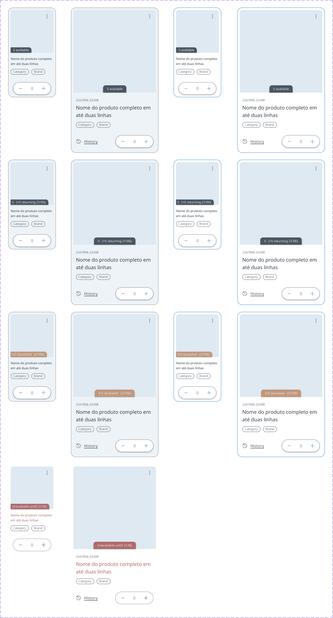
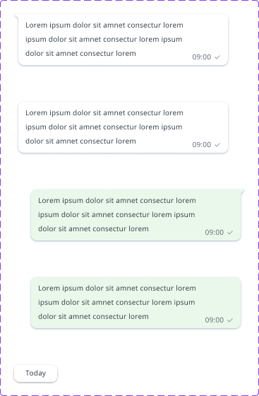
All the components used on the prototype were crafted by me. Since the goal was to make a mobile app, they have few proprieties and variations.






What did I learn?
Here are my final thoughts about what this project was for me and what did it meant for my evolution.
This project was based on a techical challenge I made at the end of 2025. I took this opportunity to make an end-to-end study case and to use some tools I was curious about, such as: buliding protopersonas with AI , make 3 layers of design tokens, design interfaces and components focused on mobile and use WCAG contrast checker tools.
Although, there are some things I wish I could have done differently:
→ I would research less about the overall market and more about quotating softwares:
It was essencial to find out what was relevant for business to draw a good strategic approach, but I missed some context of what a quotating system should have, what are the most important features, what is essential and if there are some visual patterns.
→ Crafting design tokens can take a huge time, but it really standarize decisions
After I defined some tokens for color and typography and created some components, I was confused on how to scale it to more complex components and on interfaces. With the semantic tokens, I could take this decisions easily, wihtout losing consistency. It was extremelly helpfull.
→ 3 token layers can be helpful on big scalable projects, but it can make the workflow slower on smaller projects
As I said, standarize decision was really good, and the tokens helped me a lot when I had to rework on some design decisions, but documenting the ComponentSpecific tokens took me lots of time. Since it wasn’t a highly complex system, and it was not my intention to prototype all interfaces, I think that deep down on tokens this way wasn’t really necessary.

improvements i would make
I think the prorotype deserved some micro-interactions. I would craft some loading screens, state changes and some other visual animations that could increase the product value;
More institutional screens could increase the value of the product too. I liked the visual identity I made, but since I focused on the main funcionalities, I didn’t have too much opportunity to apply some visual assets.
An use case where the user should report a bug or an issue to the supply chain department should be a good plus, since it could be a realistic situation.

Still interested in viewing the files? here they are:
PROTOTYPE
RESEARCH
Visit other cases:

UI guideline
A guideline designed to improve Smartbreeder's solutions, with potential to become a design system.
ADVOCACY RESPONSIVE WEBSITE
A website with a structure focused on services, customized for a company that is starting out in the legal field.
Let’s design together!

graphicdesigner.marcus@gmail.com

+55 (19) 99430 4848
Location
Currently living in Piracicaba (SP).
Looking for new cities.

DOWNLOAD MY RESUME

Marcus Vinicius Henrique Belli
// Product designer
I’m also here:


